Background
In 2019, my colleague and I conceptualized a tools system centering around a user’s daily interactions with their health. This project pitch aligned with corporate objectives and in 2020, we launched the optimized Drug, Doctor, and Pharmacy Tools for eHealth Medicare to help customers personalize their search for a Medicare plan.
Key Highlights
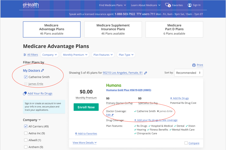
Designed the optimized Doctor & Pharmacy Tool - a customer-centered feature which increased enrollment by 17.7% and allowed users to shop for plans that cover their personal doctors.
Defined the framework of our Tools UX, which continues to be used and expanded upon within the eHealth online shopping experience.
About eHealth
eHealth is an online health insurance marketplace where customers can find plans from 180+ top insurers nationally. With over 5M+ customers served, eHealth is a leader in providing a customer-centered experience in the complex system that is healthcare.
About eHealth Medicare
eHealth Medicare focuses on the Medicare customer and provides a unique level of comprehension and guidance through our dedicated agent-centered phone services and online shopping tools. In the online shopping experience, our personalized tools and customer-focused dashboard provide a self-guided process that connects the language of insurance plans and costs in a way customers relate to and comprehend in their daily lives.
Details
Doctor Tool
Designing the doctor tool required taking a step back to look outside of how the health industry differentiate healthcare providers, refocusing attention on how a consumer understands their existent doctor’s search.
Insurance comprehend doctors at a much more complex level and include search by specialty, hospital association and private practices.
The customer’s level of understanding can vary greatly based on life experiences. Customers with chronic conditions, for instance, constantly deal with health management in their daily life, but that doesn’t mean these “seasoned warriors” want to be required to have constant up-to-date knowledge in order to live their lives.
At its simplest, we found (through user studies, data analysis, and call center observations) that most Medicare-aged customers know the name of their doctors.
We couldn’t do anything about the visual identifiers due to API limitations, so focused our attention on simplifying doctors entry on our website.
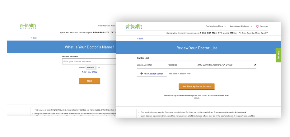
The old Doctor Tool (pre-2020) took the user out of the shop experience and into a separate page.
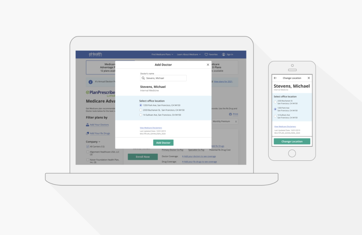
The new Doctor Tool (2020) floats within a modal to allow the same component to be opened from various pages and keep the user within their current experience.
The original doctor tool was difficult to navigate and required the user know precise spelling of doctor they are search for. The new doctor tool simplified customer data entry to JUST the first name. The user could search for their doctor like a normal browser search. We even handled fuzzy searching by surfacing the most likely match as the user typed.
Doctor Tool (Mobile) - on first launch of Doctor Tool, user sees the search to start.
We used fuzzy keyword search that reacts to each character typed and show speciality for the user to be able to identify the doctor they are looking for.
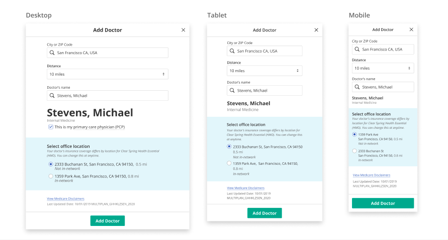
In case doctor has multiple addresses, we display all the offices associated with that doctor and allow the user select the address they use.
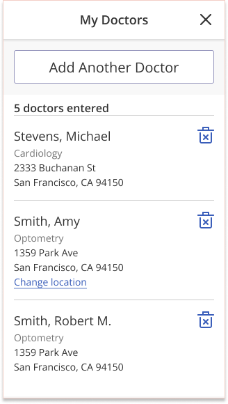
Once a doctor is added, the user is taken to a summary screen where they can see their doctor’s list. On desktop, the user can also print this list for their own uses
Once a user adds their personal information and exits the Doctor Tool, they are able to filter and select plans based on doctors they selected.
Tools UI Framework
Doctor Tool (and Drug and Pharmacy Tools) was conceptualized with the potential to do more for the user than narrow down Medicare Plan options. My passion to reduce friction in personal healthcare is what led to the ideation of these "manage your information" tools. Therefore, it was important that its design be flexible so it could exist in multiple experiences.
A modal framework was ideal to allow the tools to be opened from various locations while still keeping the user on the current page.
The design of the tool itself was kept minimal in order to not create visual clutter in this modal state. Rather we relied on typography, spacing, and blocks of color to create a visual flow. Certain navigational elements (such as a sticky header with a close X and optional back arrow (depending on whether the user entered this screen from another modal or from a host page) were kept consistent across all tools to create a reliable and recognizable UI pattern for the user.
Pharmacy Tool
Prescription details page of the Drug Tool
“Add Doctor” screen of Doctor Tool
Full design specs of the modal, including screen height variances . This was used to keep the layout consistent across the designers and the different development teams using this component.
I’m a strong believer that the best way to learn is to try. I would preemptively collaborate with the Product Owners and stakeholders to define the deliverables and project structure before initiating a “kick-off” with the primary designer.
Alongside Drug Tool, Doctor and Pharmacy also are used throughout the eHealth experience and have been integral in improving conversion. Customers who used Doctor Tool were 3x more likely to enroll in a plan.
Final Thoughts
As eHealth continues to grow and expand their online capabilities, these tools become a foundation to the customer's self-guided experience with us. My original intention was to move eHealth away from a single-transaction mindset to considering themselves as a reliable web portal for the Medicare customer.
Each year brings eHealth closer to this vision and my hope and intent is to encourage that focus as new projects are defined and scoped each year.
